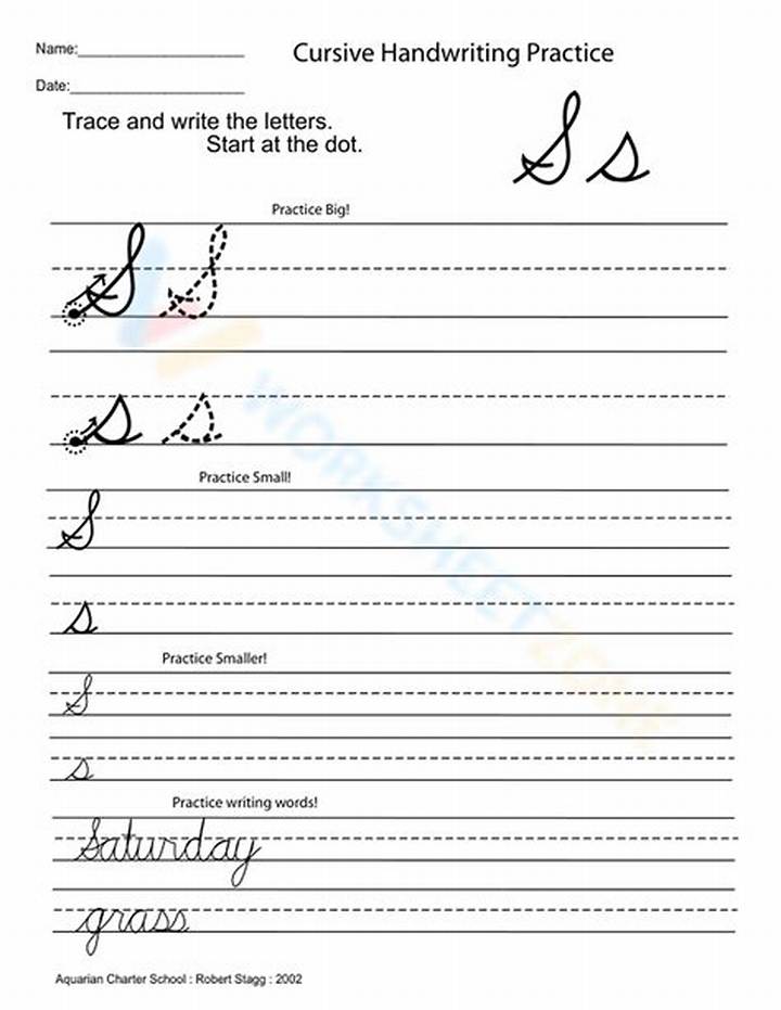
Some capital S failures aren’t really letter failures—they’re setup problems. If your grip is too tight or your hand position forces you to rotate awkwardly, your curves will tighten and your turns will break.
Use a relaxed grip
Try writing for 10 seconds with a softer hold. If your lines suddenly look smoother, you’ve found the source of the wobble. Tension shows up fast in cursive because every curve depends on steady motion.
Mind the height relative to other letters
Compare your capital S to nearby capitals or tall lowercase letters (like h or l, depending on the worksheet). A capital S that’s too tall will distort the spacing of the entire word.
Keep the “S” centered on its stroke guide
Most practice lines include a baseline and often a midline or height guideline. Aim to keep the middle of your S around the middle guide, not dragged down or pushed too high.
Spacing is what makes your letter look intentional. Consistent height and centered curves usually matter as much as the curve itself.

